
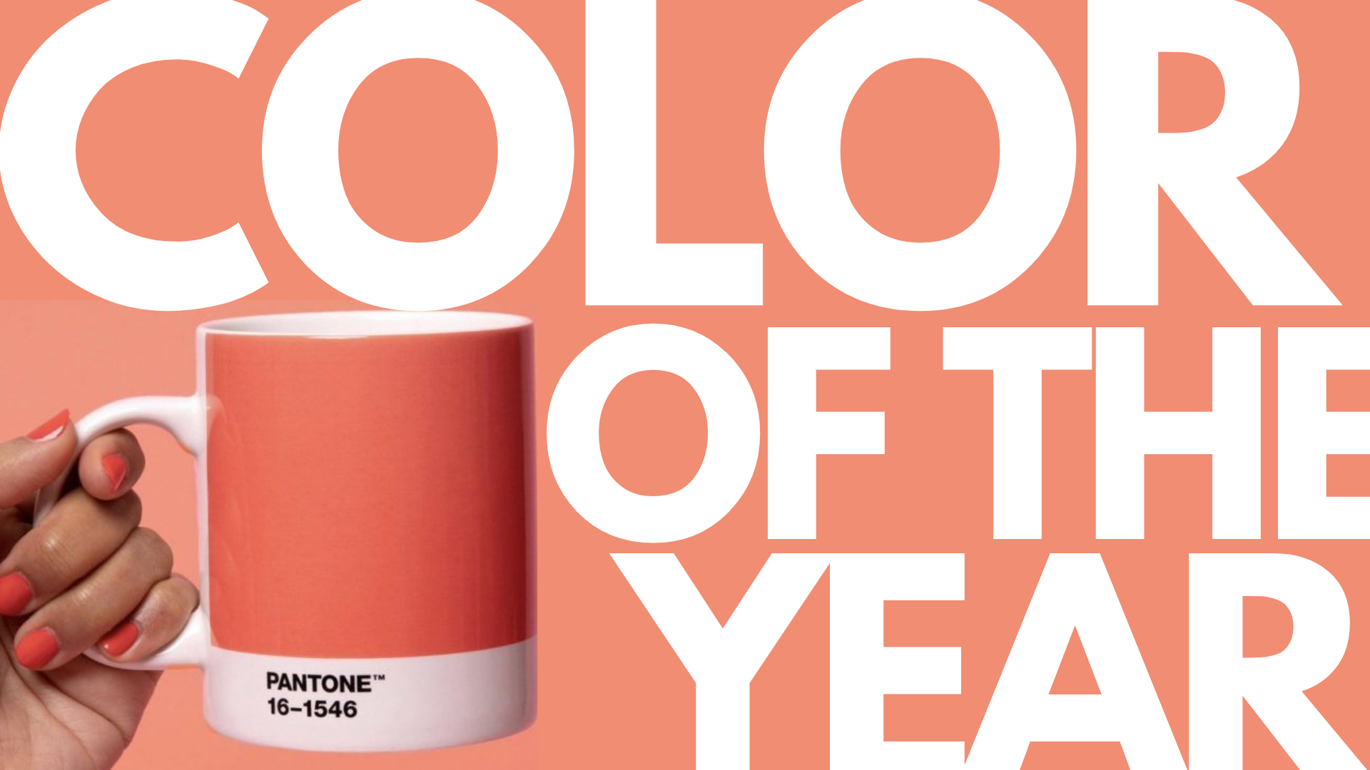
Pantone’s Color of the Year Promises Optimism for 2019
“Color is an equalizing lens through which we experience our natural and digital realities and this is particularly true for Living Coral. With consumers craving human interaction and social connection, the humanizing and heartening qualities displayed by the convivial PANTONE Living Coral hit a responsive chord.”
-Leatrice Eiseman, EXECUTIVE DIRECTOR OF THE PANTONE COLOR INSTITUTE

Image Source: Pantone Color of the Year 2019
2019 is the year of energy, warmth, and positivity — as vibrantly illustrated in Pantone’s selection for the Color of the Year.
Meet the 16-1546, otherwise known by its life-affirming name, “Living Coral.”
The PANTONE 16-1546 Living Coral’s announcement as Color of the Year could not have come at a better time. In a year that has been wrought with global uncertainty, Living Coral, with its comforting quality — an almost familiar type of warmth and with the vitality of its hue, is a color of reassurance of the endurance of life.
The lively coral shade with its golden undertone echoes its real-life counterparts that reside in our oceans and seas. Unfortunately, 2018 saw the demise of half of the earth’s largest coral reef, The Great Barrier Reef. Perhaps the Living Coral is both a nostalgia and reminder for our generation to save whatever is left of our home – earth.

Image Source: Living Coral
Return to Nature
Perhaps, the Living Coral is Pantone’s subtle hint for us to reconnect with nature and our environment. The Pantone Color Insitute, in its official statement explains, “We get energy from nature. Just as coral reefs are a source of sustenance and shelter to sea life, vibrant yet mellow Living Coral embraces us with warmth and nourishment to provide comfort and buoyancy in our continually shifting environment.”
On the other side of things, despite the seriousness of its message, Pantone also affirms that Living Coral is, “Sociable and spirited, the engaging nature of Living Coral welcomes and encourages lighthearted activity. Symbolizing our innate need for optimism and joyful pursuits, Living Coral embodies our desire for playful expression.”
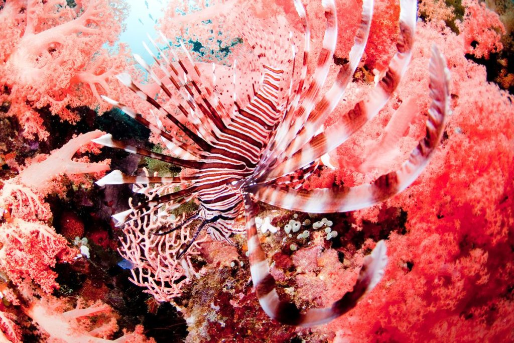
Image Source: Yusuke Okada / Adobe Stock
Past Forward
“The more things try to push us forward, the more people reach back to what was because they’re looking for terra firma. It’s scary! So you want things that make you feel safe, happy, that bring you comfort and warmth.”
-Leatrice Eiseman, EXECUTIVE DIRECTOR OF THE PANTONE COLOR INSTITUTE
According to the Pantone Color Insitute’s Executive Director, Leatrice Pressman, “Living Coral has roots in the 1950s and ’60s, where you could see it in cars, accessories, and fashion.”
The orange-pink hue evokes an “almost a retro feeling” to this color of Americana, which harkens back to “simpler times” — an all too familiar sentiment in our current political, social, and economic climate of this year.
Style and Versatility
Beyond the philosophical implications of 2019’s color choice, Living Coral also actually is a very versatile and attractive hue that applies to design trends across the board. The predominantly orange color base complements various skin tones, which is why this color was a dominant feature in various fashion lines and in emerging beauty trends.
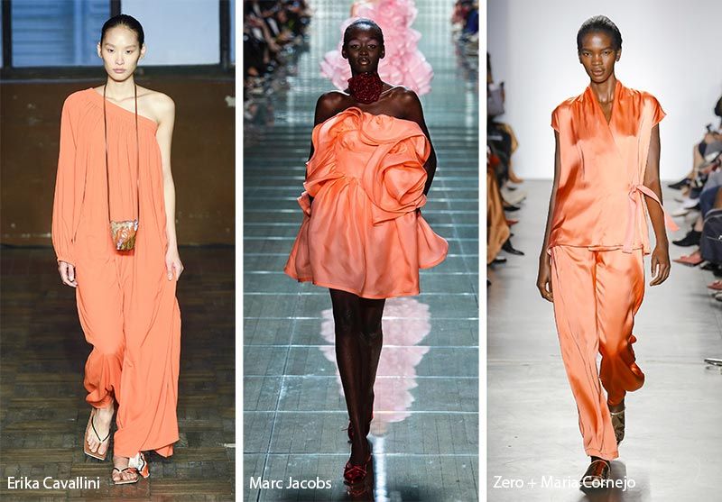
Image Source: Fashion Now
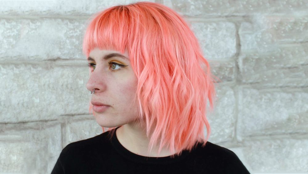
Image Source: Instagram, @jmcintyrehair
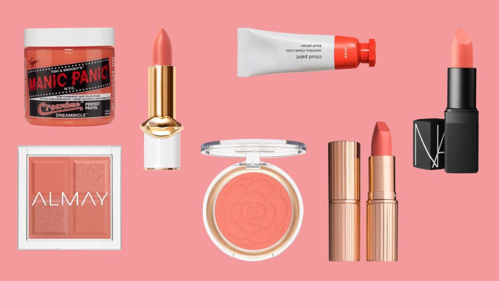
Image Source: Allure
Trendy Neutral
Despite being highly saturated and warm, the Living Coral is an unexpectedly versatile tone. Interior design trends use the hue as an accent color or a feature highlight that surprisingly ties in a “look”.
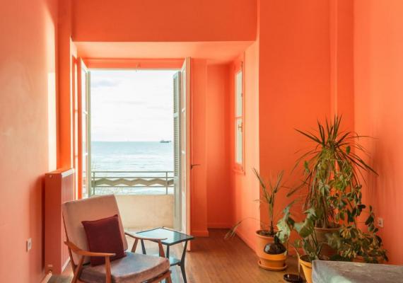
Image Source: Waterfront
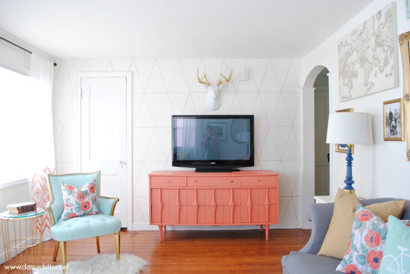
Image Source: Classy Clutter
Living Screen
It comes to no surprise that Apple also chose the same hue for its iPhone XR variant even before Pantone themselves unveiled the color choice. On screen, Living Color is eye-catching enough to be favored in digital content for an ever-evolving design landscape. Living Color pops visually not just because of its vibrancy, but also because it’s a color inherent in nature — a delicate balance that closes the gap between the real and hyperreal.

Image Source: Dribble, Rafał Sieńkowski
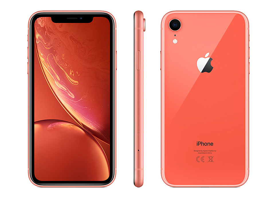
Image Source: Walmart
Positivity and Optimism in 2019
About Pantone Color of the Year
For 20 years, Pantone’s Color of the Year has influenced product development and purchasing decisions in multiple industries, including fashion, home furnishings, and industrial design, as well as product, packaging, and graphic design.
The Color of the Year selection process requires thoughtful consideration and trend analysis. To arrive at the selection each year, Pantone’s color experts at the Pantone Color Institute comb the world looking for new color influences. This can include the entertainment industry and films in production, traveling art collections and new artists, fashion, all areas of design, popular travel destinations, as well as new lifestyles, playstyles, and socio-economic conditions. Influences may also stem from new technologies, materials, textures, and effects that impact color, relevant social media platforms and even upcoming sporting events that capture worldwide attention. (Source: PANTONE)